Quantros produces software for the healthcare industry, focused on creating safety and quality tracking and measurement in healthcare patient settings. I primarily worked on projects related to the Quantros Safety Event Manager, used in hospital settings as well as a similar system used in retail pharmacies.
Hospitals track actual and near miss incidents, identify frequent and risky issues, and investigate why an incident occurred and how it might be prevented in the future. The government requires organizations to report very significant safety incidents to the Centers for Medicare and Medicaid (CMS), which use the information as criteria in their hospital quality care ratings, publicly available to consumers.
I was hired as the first User Experience Designer at the company, a reaction to Quantros loosing significant market share to a new competitor. I started investigated the current state by gathering information from nurses, healthcare quality specialists, hospital administrators, hospital security staff and others who reported incidents as part of their responsibilities, traveling to hospitals in order to see their working environments. I also spoke extensively with Quantros’ internal experts (primarily RNs) who consulted with client hospitals, our support staff, and the product manager to get a variety of perspectives. At the conclusion of this investigation, I presented my findings on the most significant issues affecting users.
Existing usability issues
- The existing reporting form required users to categorize the incidents according to an enormous taxonomy of 2000+ event types, organized into a hierarchy. Users had difficulty finding the correct path through the taxonomy, frequently “pogo-sticking” throughout the taxonomy to determine how Quantros had categorized an event type. This information was required in order to save a draft of the report, so there was a high rate of abandonment.
- The form was not well organized. Critical questions did not come first. Similar information was not grouped logically. Users didn’t know how many questions remained (depending on the answers they selected, additional questions displayed).
- Questions and answer options on the form were often unclear. Sometimes this was due to ambiguous wording. Some questions were so poorly constructed that the hospitals did not rely on the answers, but nevertheless, the answer was still required in order to proceed. Some questions had multiple choice answers which were very detailed and required users to carefully read paragraphs in order to differentiate between options.
How users’ issues were addressed
- Designed a new form for reporting incidents. The UX team defined personas and user scenarios, created interactive prototypes of the new form in Axure, and wrote user stories in Rally. We brainstormed with engineers and determined a way for the system to predict the most likely safety event category for the incident based on the user’s description of what happened (a “smart classification” system — view user story). After typing the description, the system displayed top matching safety event categories, allowing the user to either select one or to search/navigate the taxonomy for alternatives.
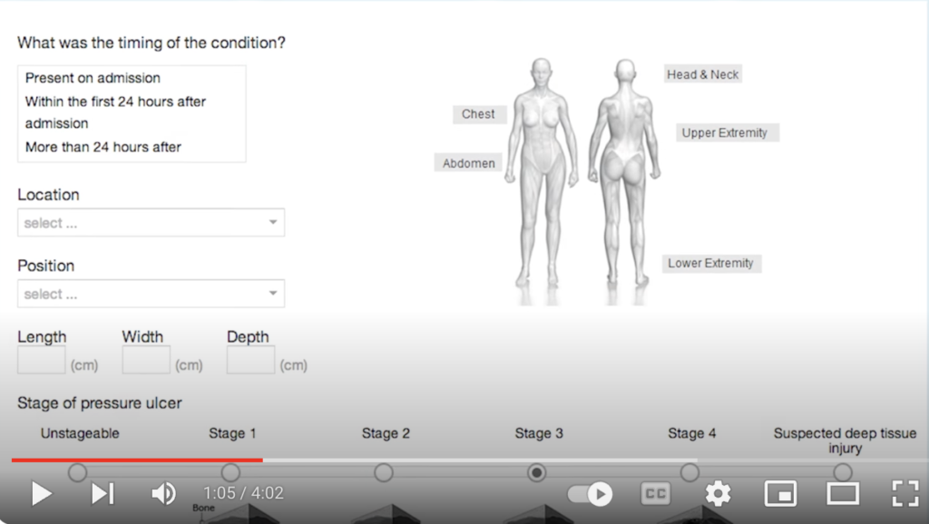
- We organized the form into 3 sections. The first section was limited to crucial information only, and once completed, users could save and complete later. The second section was the Smart Classification, where the system suggested the event type based on the information in section one. Users were able to either select from the suggestions or navigate the taxonomy to select something different. We designed a new UI control which allowed very fast and flexible navigation of the 3-tier hierarchy. The third section of the form was dedicated to the specific follow-up questions for the selected event type. For instance, the questions posed for a patient falling were different from those for a medication mistake.
- Revised the taxonomy. This work was led by the chief medical officer, collaborating with other medical professionals to ensure accuracy. Duplicate terms were eliminated; similar but different terms were revised to make clear their differentiation; the number of top-level categories were reduced; new safety event categories were added.
- We reviewed all questions on the form and made improvements to wording, ensured the UI control was appropriate (i.e., checkboxes vs. radio buttons), and designed custom controls in some cases, such as providing illustrations to increase accuracy and speed up data entry. Content experts did a final review of questions in context of how they would appear on the form.
- The form to report was built with responsive design to ensure it worked on mobile tablets (standard equipment for nurses in many hospitals) or smartphones.
Results
- Average form entry times were reduced by more than half (now 6-10 minutes to complete compared with ~20 minutes before).
- Overwhelmingly positive feedback from users; huge hit at the 2014 ASHRM conference.
- Implemented in over 2500 healthcare facilities nationwide.
- Modeled Agile Scrum processes for the organization in preparation for implementation across all teams.
Safety Event reporting form improvements
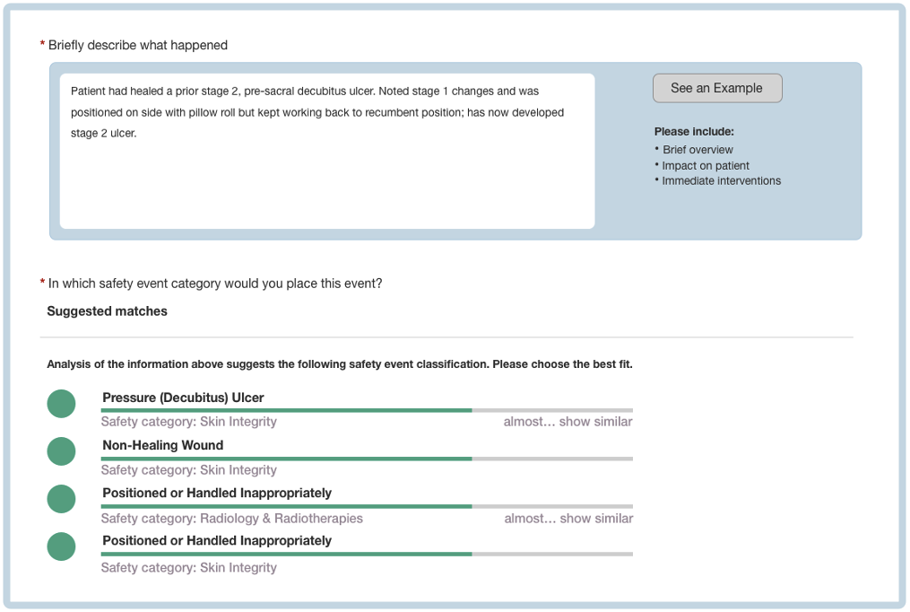
Once the reporter has entered the description (“Briefly describe what happened”) the system provides a list of the most likely classifications. The user story for Classification Suggestions explains the new feature.
When a classification is chosen, the form displays additional questions, relevant to the chosen classification. This example shows questions related to a pressure ulcer.